
We are excited to share more about our work to maximize its reach and beneficial impact. This includes posts that highlight our thinking, resources that explain what we are building, and sharing novel datasets that we think can benefit the work of others.
How long should it take to learn whether a site deserves a second look?
For most infrastructure teams the answer is still weeks. Research is scattered and manual, and the first red flag often appears after real money has been spent.
Today we are releasing the beta of Scout, at scout.othersphere.io, a public app to screen infrastructure sites anywhere in the world. Choose an asset type, choose a location, and instantly see an initial screen of its viability.
Othersphere exists to optimize the deployment of high-performance infrastructure worldwide. Our platform indexes more than 60 datasets to over 180 million locations, and models each one from the bottom up.
Until now, that work has mostly reached people through our Explorer software and our full site assessments. Scout opens a narrow view of the same derived data to anyone who wants to look.
Scout has three steps:
The beta launches with two asset types: data centers and utility-scale solar PV.
Scores are for a generalized version of each asset type. Project details, such as the size of a solar facility or the power supply goals of a data center, would shift how factors are weighted.
Weighting is a judgment, not a measurement, and different stakeholders will weigh the same factors differently. A few constraints are severe enough to be deal-breakers, which set the overall score to zero.
Scout shows topic scores and not the underlying values, because much of the data behind them is licensed. The FAQ in the app explains how the score is built.
Scout is deliberately light. It scores dozens of data topics indexed to each ~0.7 km² tile, which is enough to decide where to look harder. A full site assessment is where that harder look happens.
A full assessment adds factors the global screen leaves out entirely, such as community sentiment and permitting, along with detail on labor availability, zoning, and incentive programs. It works at the level of the individual property, confirms and refines the screening data with hyperlocal research, and ends with comprehensive scoring and a go/no-go recommendation.
Assessments typically run 100-150 pages of fully cited analysis and arrive in three days or less. They are available today for data centers and now utility-scale solar PV.
In the months ahead we will keep adding asset types to both Scout and our site assessments. Onshore wind and BESS are next in line based on feedback so far, and we want to hear which assets matter to you.
So please explore the globe and share it as you see fit. Scout is in beta ahead of its formal launch, and your comments will shape what we add.
If you need detailed diligence at a location you choose, request it through the app or reach us at explore@othersphere.io.
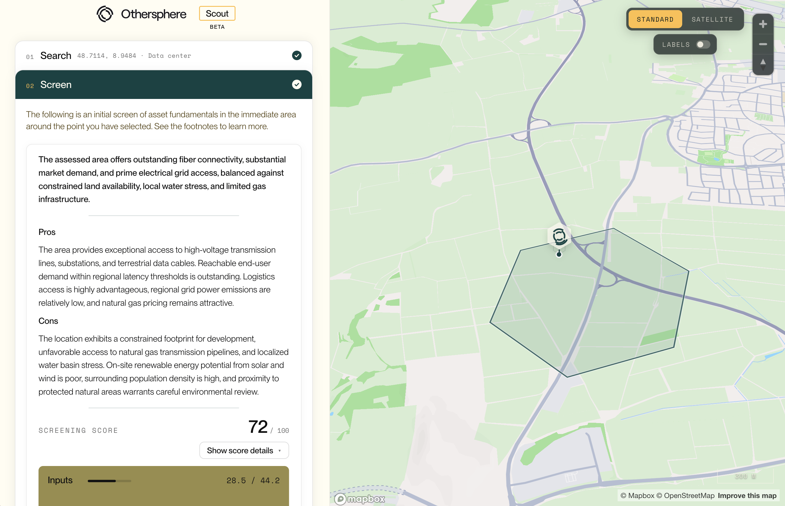
How long should it take to learn whether a site deserves a second look? For most infrastructure teams the answer is still weeks. Research is scattered and manual, and the first red flag often appears after real money has been spent. Today we are releasing the beta of Scout, a public app to instantly screen infrastructure sites anywhere in the world.

What decides whether a utility-scale solar project gets built? It is never just the sun, as projects more often stall on grid queues, planning risk, land encumbrances, and local opposition, and those tend to surface after weeks of research and spend.
Today Othersphere site assessments are generally available for utility-scale solar PV. Each one delivers detailed, fully cited diligence on a location you choose, in three days or less.
We released site assessments for data centers earlier this year, and teams have since used them across North America, Europe, Asia, and Oceania. Solar PV is the first expansion of that coverage.
The method is the same. Our platform indexes more than 60 datasets to over 180 million locations. An AI research system then investigates the local detail that global data cannot hold, reviewing thousands of documents, webpages, and videos. Our team reviews the result before delivery.
Assessments typically run 100-150 pages. Each one has four parts:
An optional module adds asset-level financial analysis, using our models or yours.
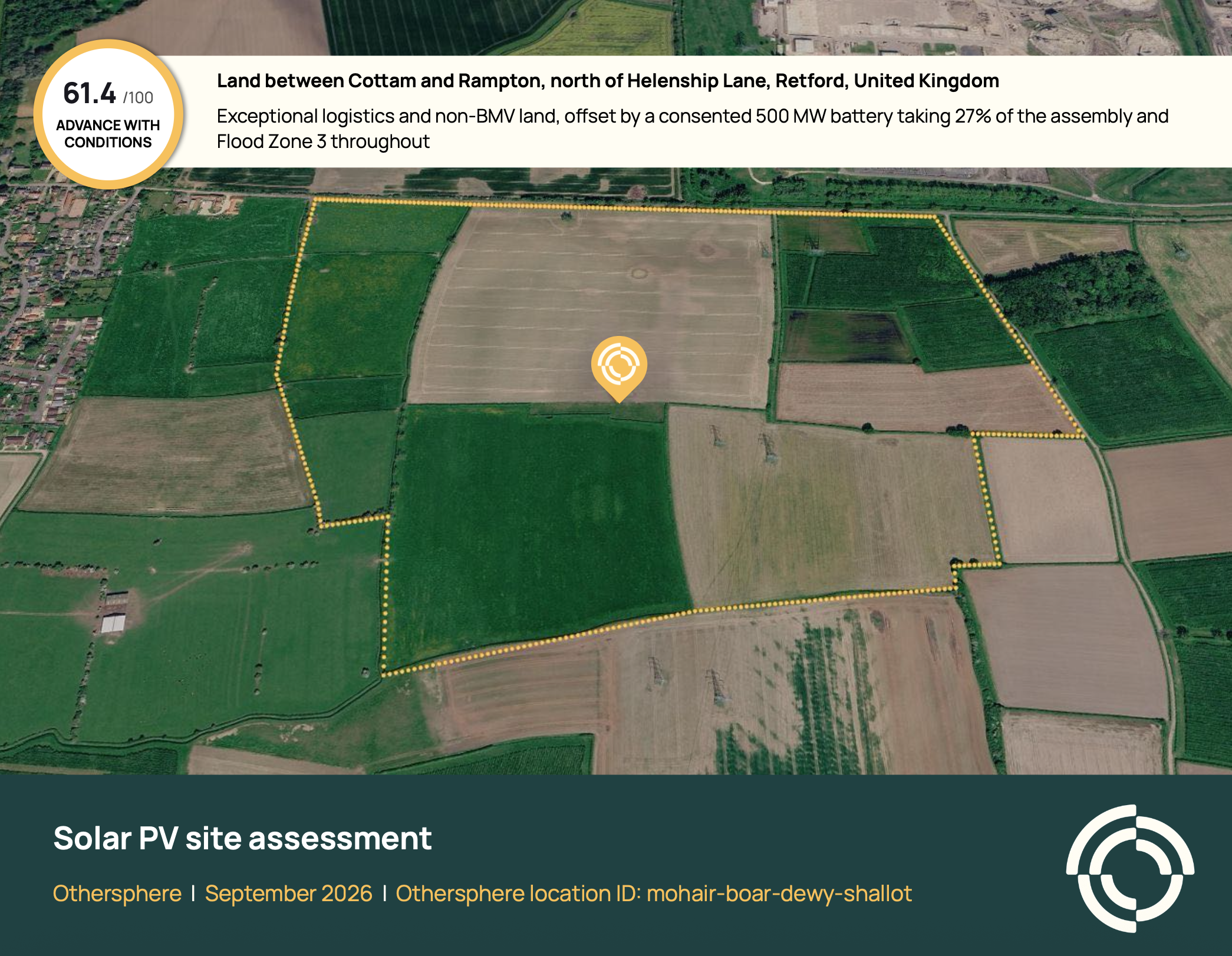
This sample assessment covers roughly 27 MWp of solar on farmland near Retford in the United Kingdom. It scores 61.4 out of 100, with a recommendation to advance with conditions, across 143 pages and 477 cited sources.
The solar resource is viable and the logistics are exceptional. The findings that decide the project sit elsewhere:
The assessment closes with four specific actions to take before committing more capital, from a grid connection application to a topographical survey.
Slow diligence limits pipeline quality, because a team can only look closely at a few sites. With a full assessment in days, developers can vet more locations and drop the weak ones before paying for options, surveys, or consultants.
For operators and financiers, the same report gives a cited view of project fundamentals before capital is committed. Across our assessments, teams reach decisions in 95% less time.
An assessment does not replace surveys, title searches, or professional advice. It tells you which of them to commission first, and which sites do not merit the expense.
The quickest way in is Scout. Select utility-scale solar PV, screen your location, and request a full assessment from within the app. A request is not an order; we follow up to confirm the location and asset configuration first.
You can also reach us directly at explore@othersphere.io.
Onshore wind and BESS are next in line for both Scout and our site assessments. If there is an asset type you need sooner, please tell us.
What decides whether a utility-scale solar project gets built? It is never just the sun, as projects more often stall on grid queues, planning risk, land encumbrances, and local opposition, and those tend to surface after weeks of research and spend. Today Othersphere site assessments are generally available for utility-scale solar PV. Each one delivers detailed, fully cited diligence on a location you choose, in three days or less.
When assessing data center sites, there can be a balancing act between remote locations and those closer to population centers.
Remote locations can offer clear advantages, including more building space or possibly lower-cost energy. But for AI inference, colocation, and other traditional compute needs, being closer to population centers of end-users is critical.
For data centers, fiber infrastructure plays a central role in that equation. Though factors like access to energy, community sentiment, and the permitting environment are a critical part of site assessments,this infrastructure is only as valuable as the user base it can reach.
To support this decision-making, we recently added a new data layer to inform Othersphere’s data center diligence engine, and we’re excited to share more about this work (to say nothing of the pretty maps).
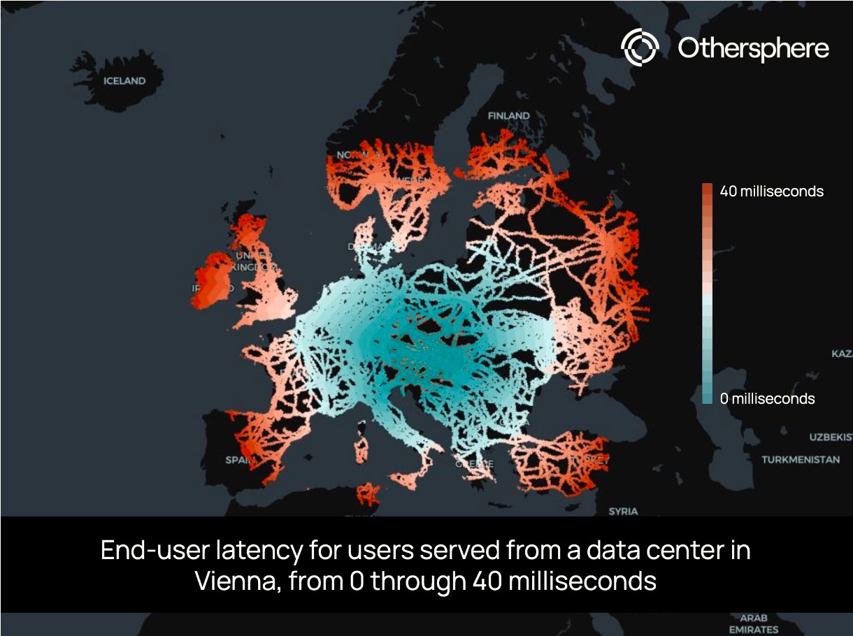
This new data layer provides an estimate of the population that can be reached from any location within certain latency thresholds. It adds an important dimension to site selection by helping clarify the tradeoffs between locations that may look attractive for different reasons.
This is made possible through our infrastructure analysis methodology, which indexes critical data to millions of locations and models the relationships within and between them. For this population estimate, the calculation begins by overlaying the world’s terrestrial and submarine fiber cable infrastructure on high-resolution population data. We then construct a weighted graph covering the entire globe, where adjacent tiles are connected by edges to calculate round-trip latency. As the signal moves from any user-selected location across on-fiber or off-fiber tiles, varying time penalties are applied. At a global scale, this requires simplifying assumptions on key questions such as available capacity, which we are able to investigate more deeply in each site-specific assessment.
This bottom-up estimate reveals stark geographic disparities. A well-connected tile in Europe (a randomly selected address in Vienna, in this case) can reach hundreds of millions of people within 40 ms, while a tile not far away in a telecom gap may only provide low-latency services to its immediate neighbors.
This data layer powers Othersphere’s understanding of where digital infrastructure creates (or fails to create) meaningful connectivity, and it is now threaded into all of our site assessments and scoring.
Reach out if you would like to learn more, or comment below if there are locations you’d like to see us post about.
When assessing data center sites, there can be a balancing act between remote locations and those closer to population centers.
Click here to access the Othersphere Data Center Atlas
What does the market view as a good data center location? This is something we can clearly observe based on how data centers are deployed today.
But how will the definition of a successful project evolve over time? And how might this differ across different classes of data centers?
Planning for the long-term, it is important that markets and policymakers are intentional about their expectations and requirements for these assets, as the role of data centers in economic growth, energy demand, climate outcomes, and geopolitical stability will all undoubtedly increase.
Then in the near-term, the risk of data center investment bubbles and market swings appear very high. As such, the ability to target data centers with strong fundamentals that will succeed in both good times and bad is essential.
History smiles on those who build commoditized industrial infrastructure in locations with the best fundamentals, so who will be the 'Saudi Arabia of compute'? The race to acquire power for these information refineries is the dominant narrative today. But when the smoke clears it will be key long-term fundamentals that matter to operators, policymakers, investors, communities, and beyond.
With this framing in mind, this Data Center Atlas is our contribution to inform a more data-driven view of the shape of the global data center fleet today, and how this may evolve over time.
At launch this Atlas includes a sample of the metrics we use to evaluate existing and potential data center locations. Here we highlight trends at the thousands of sites around the world that host data centers today, drawn from the over 180 million locations that Othersphere models worldwide. We are also experimenting with AI-generated/human-reviewed context for each metric; with AI model outputs shaped by the data provided from our backend.
This living document is also a pilot for future report-centric products on data centers and other industrial sectors, helping us understand needs around:
Reach out to learn more or provide feedback, and in the meantime, thanks for reading!

What does the market view as a good data center location? This is something we can clearly observe based on how data centers are deployed today.
VICTORIA, BC, Sept. 9, 2025 /PRNewswire-PRWeb/ -- Othersphere announced its participation in Google's AI for Energy program, with the collaboration focused on accelerating deployment of innovative report-based intelligence products for data centers, hydrogen production, and other energy-intensive infrastructure.
Expanding on Othersphere's existing enterprise software products, these reports utilize rigorously structured platform data from Othersphere to guide generative AI—delivering powerful new products tailored to project or portfolio design and diligence.
Key Highlights
"By combining Othersphere's data and asset modeling with generative AI, we're giving infrastructure decision-makers something they've never had before: instant, reliable insight at the scale of the global market," said Robert Murphy, CEO of Othersphere.
Market Impact
These reports will be available on a standalone, targeted basis, and will also be integrated into Othersphere's Explorer software products. By layering narrative-level synthesis atop rigorous global data and detailed modeling, Othersphere enables:
About Othersphere
Othersphere accelerates deployment of high-performance industrial infrastructure. This search engine for sustainable infrastructure is driven by vast amounts of consolidated global data, and billions of bottom-up project models, across millions of individual locations. Backed by Breakthrough Energy Fellows, Othersphere enables infrastructure stakeholders such as project developers, OEMs, financiers, and operators to reduce costs, accelerate action, and improve long-term asset performance. Visit www.othersphere.io to learn more.
About Google AI for Energy Program
The AI for Energy program focuses on grid optimization, demand flexibility and energy solutions for customers, including utilities and commercial entities. By supporting advancements in areas such as interconnection queues and carbon-aware infrastructure, the Accelerator aims to drive innovation, sustainability, and reliability in the energy landscape. Learn more about the Google for Startups Accelerator: AI for Energy program here.
Contact
For more information about these new report offerings, or to explore integration into your work, contact:
Othersphere Systems Inc.
Phone: +1 (236) 428‑4400
Email: press@othersphere.io

Othersphere announced its participation in Google's AI for Energy program, with the collaboration focused on accelerating deployment of innovative report-based intelligence products for data center, hydrogen production, and other energy-intensive infrastructure development.
Hi, I’m Jules Carney! As a front-end engineer at Othersphere, I’ve had the chance to work on features that would have felt impossible to bring to the web even a few years ago. We bring together detailed, accurate data from across the globe, and use it to paint a picture with graphs, maps and other visualizations. It brings insights on potential sites that tell meaningful stories for any audience. Needless to say, working on these features is a web developer’s dream come true!
Today I’ll walk through one of my favourite feature sets, because it imparts so much info about a potential site that users looking for a site could feel like they’re on the ground with their measuring tapes.
For a full video of the walkthrough below, please click here!
Let’s say a team wants to build a data center near Boulder, Colorado, but is worried about how the landscape will fit in with their building designs.
First, we’ll make a stop at the main map, where we can filter based on attributes we want the site to have, like average slope, land cost, distance to roads or power sources, and many other crucial factors. In the picture below, we’ve filtered to return sites with only 0-5% built area, and are colouring our heat map based on topography. Less populated areas tend to have steeper slopes, but with just this three second search we see some pale yellow hexes which are nice flat sites with few built-up areas. We could also do another search including our slope requirement filters if we wanted to just get back the hexes with lower slopes.

After we’ve picked a site, we can jump into site analysis. Looking at the left-hand tabs, we can see many ways to evaluate our location, including factors relating to economics, emissions, and fit with local human and environmental factors. These factors are then rolled into detailed project modeling, to bring the whole story together.
But let’s assume that the fundamentals look good, and so we want to move to the footprint tab as concern becomes fitting our data center to a given site.
First we check out a site, and we have a good sized potential footprint to work with, close to high voltage powerlines and data transmission cables.

Let’s assume we want to build a site about 1km square, so we check out an area with our Measure area tool.

It looks decent, and not built up, but let’s dig into the elevation and landscape a little more. We draw a line to measure the distance of our potential site, and we also get an elevation profile, which reveals a pretty significant variation of over 20 metres.

This area looks more promising! We see less variation in the elevation profile.

When we check out the area, it looks like there will be ample space here.

As a project developer I’d likely now loop back to iterate on the project model, using this area analysis and all of our other data to fine tune potential cost, emissions, and planning for aspects of local fit such as protected areas. From there I would likely review details on the land parcels and owners, to get ready for external engagement.
By bringing all of this together in one place, we can pick a great site with no surprises and everything we need for our data center to succeed!

Hi, I’m Jules Carney. a front-end engineer at Othersphere! Today I’ll walk through one of my favourite feature sets, because it imparts so much info about a potential site that users looking for a site could feel like they’re on the ground with their measuring tapes.
Please reach out if you would like to learn more about Othersphere, our products, and opportunities to partner in accelerating deployment of high performance, sustainable infrastructure.


